

Brands: Colour, Craft and Character.
· Brand Zohran · Apple TV · Beauty dystopia ·

Brands, logos, colours, craft and personality- identity and intent come together this week.
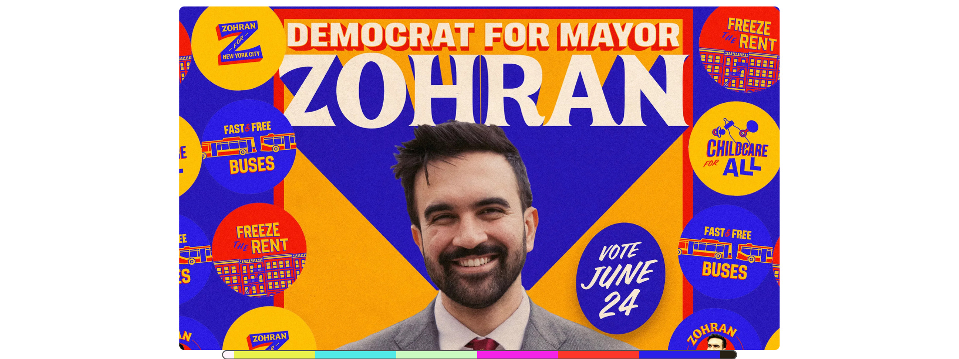
Character, Colour, Candidate: The bold and friendly ZOHRAN brand.
AppleTV: New logo, new sound, old school craft.
▶️ Curated/Cuts: the uncomfortable absurdity of beauty trends.
➕ India’s linear TV, Netflix & podcasts, Sora’s violent videos, miffed Udio users & a spy for IP.
The Colour Bar- like a friend in the industry who reads widely so you don’t have to.
🎧 Prefer to listen? Hit play above to listen to me read this week’s dispatch.

Character, Colour, Candidate
This has to do with politics, but put your politics aside for a while.
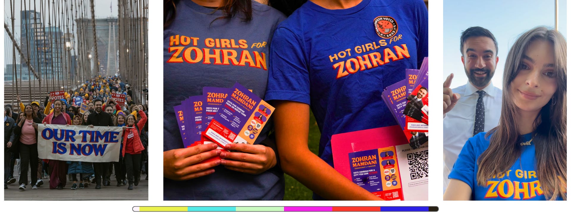
You might be far from New York City, but you’d have been hard-pressed to miss Zohran Mamdani’s historic win as the city’s new Mayor. You could have found him charismatic, inspirational or the opposite of those, but the one thing that has been very difficult to ignore, is his campaign.
Everyone’s been agog at the chops his social team have showed (deservedly!), but I specifically wanted to look at his identity / brand design. I’ve admired it from afar, but finally decided to delve in.
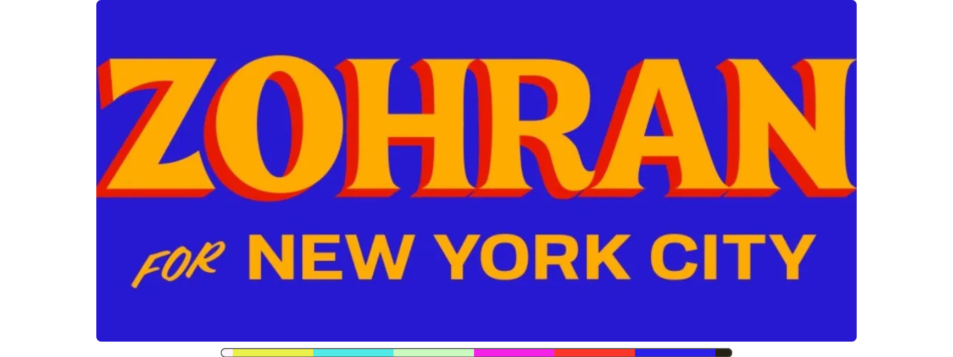
Two elements are most striking- his name, and the colours.
“Zohran was interested in pushing how expressive it could be”
The loud, confident, friendly ZOHRAN always felt a bit handwritten. Turns out it was based off a serif font called Boheld, which designer Aneesh Bhoopathy tweaked around a fair bit. There’s also a hint of vintage painted posters from Bollywood, which Mamdani sent to the design team for inspiration quite early on.
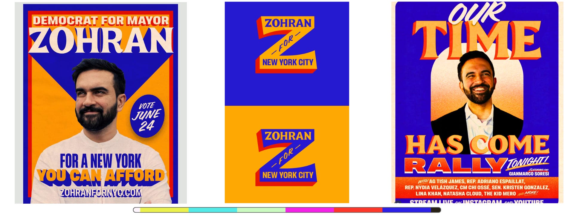
The sign said this was no ‘politician’. No corporate suit. No slick boardroom exec. The name was an emblem. A rallying call in itself. A hero. Yet, the hand-painted feel also shouts, ‘hero of the people’. It’s loud without being wild, bold without being imposing, powerful yet friendly.
“resolutely optimistic — warm, energetic, and approachable.”
But the personality doesn’t stop at the lettering. The colours are vibrant, warm, familiar… and I am not even from NYC. There’s a bit of the New York taxicab, some hints at the sports teams, the Metro card- and equally, what its not.
There’s no corporate / political/ polished blue & red.
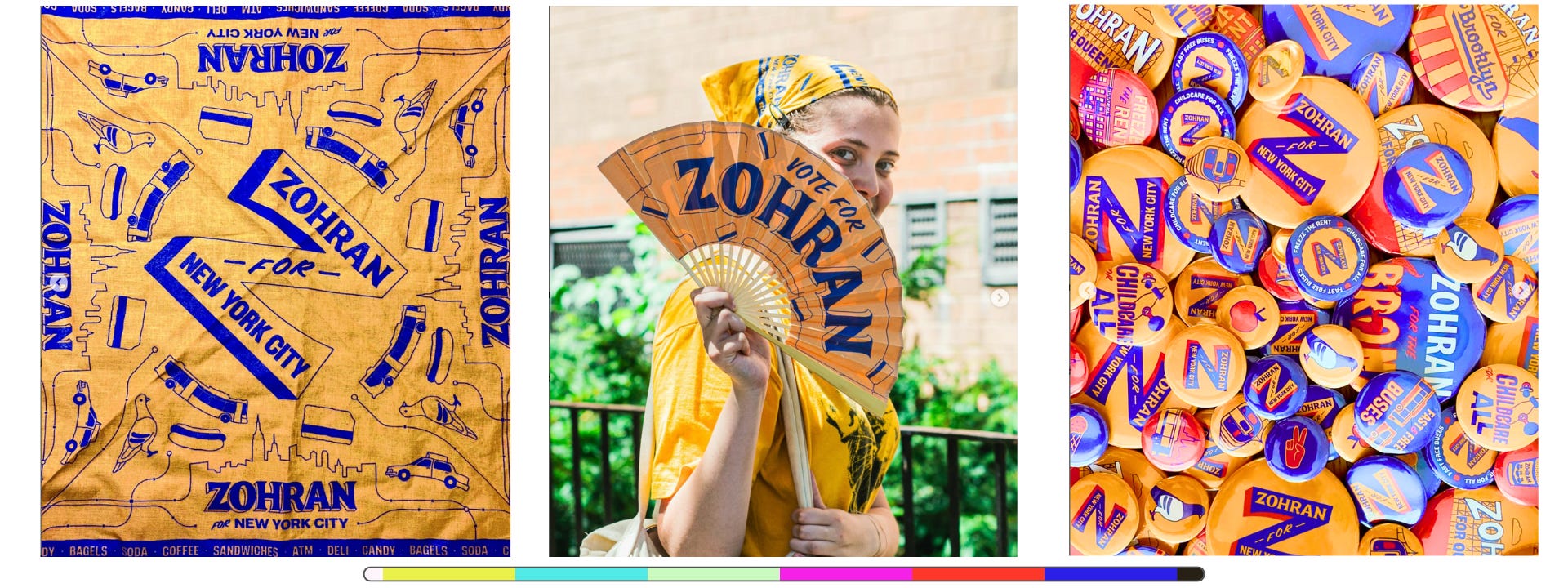
“Most political branding aspires upward - governmental, patriotic, almost corporate. This one looked sideways to community, transport, groceries, rent. The design spoke in the vocabulary of everyday life.” ^
So, it’s no surprise Aneesh says it was inspired by bodega signage. ”That bright yellow awning that’s meant to stand out. It’s a taxi cab kind of yellow that’s just built to stand out. The thinking was, ‘If it works for them, why not?’ It’s the primary colours that are on so many things in New York, like the Metro Card and the New York Lottery.” ^
The colour palette doesn’t feel imposed or imported. It feels like it belongs, while also being an invitation to belong. What a great combination that is.
“it felt genuinely alive.“
David Schwittek, a professor of digital media and graphic design in the Bronx, said the key takeaway from Mamdani’s visual coup was that effective branding isn’t generic or safe, but specific and deliberate. ^
I love that.
Too often branding is seen to be something for all. But without embracing the brand or being deeply part of it, it can be left owned by no one.
For me, this is how design feels like part of the strategy, not an execution of it.
Though maybe Aneesh Bhoopathy has the best last word, “None of the boldness and vibrancy here works without a candidate that is as energetic and full of life as the city that raised him.”
· Initial Design Aneesh + Forge · Posters Tyler Evans ·
Union Gothic font by Matthew Hinders-Anderson, who charmingly does not use the standard “The quick brown fox jumps over the lazy dog” to display his fonts. Instead, he says, “All the sample text in the font samples above is from the goddamn wonderful poems of Mary Oliver. If you’re not familiar with her work, boy are you in for a treat.”

» Above, I did a very quick retrofitted moodboard across NYC and Bollywood, which looks like it makes a lot of sense.
» And just this morning, I spotted this on-point piece from Kian Bakhtiari which highlights three key lessons for marketers from the Zohran campaign.

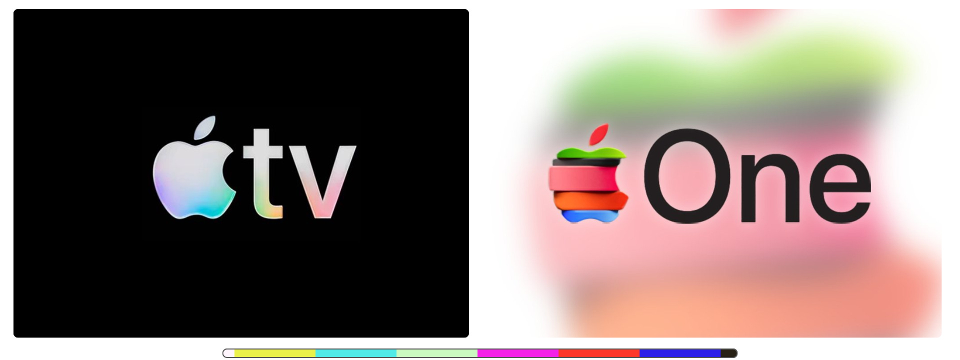
Apple logos: expensive, illogical, cool.
So you’ve likely seen that Apple TV has a new logo with some gentle colours and shimmers. The audio mnemonic is crafted by Finneas (producer, Oscar & Grammy winner, and brother of Billy Eilish). Crafting 5sec mnemonics is hard, but this has the potential to become quite memorable in a familiar way. Or do I mean familiar in a memorable way?
Said Finneas, “If you’re binge-ing a whole season… you’re going to hear the mnemonic 10 times in one day. So it’s gotta be something that’s like the bite of ginger between rolls or something, you know?” I don’t have ginger in my rolls, but ok.
Video lineup: 5sec > BTS > 12sec:
The colours and light are likely meant to echo the breadth of stories, emotions and genres that AppleTV holds within its highly-curated library.
Then there’s the instinctive joy many had on learning that this was all done practically. A joy that would’ve been real a decade ago but feels sharper now, in a time when many will ask, “Why not just use AI or do it on a computer?” Maybe it would’ve been cheaper or easier. And maybe we’d never even have known, if the BTS clip hadn’t been released.
But its part of the brand ethos, and part of the marketing schtick, to do it with humans and then gently show-off about it.
Built from real glass and captured entirely in camera, the new identity explores reflection, colour, and light to express the cinematic spirit at the heart of Apple TV. Every shimmer was made for real, no CG shortcuts, a nod to Apple’s belief that craft should be felt, not faked. _TBWA\Media Arts Lab ^
As one Louis Hu put it on Linkedin: “Inconvenient, expensive, illogical. I love it.”
There is also a 12-second cinematic version for films- though somehow (surprisingly?) I prefer the five sec one, especially the audio.
Reminder- this comes soon after the “plus” was nixed from the logo last month. So AppleTV now means the set-top box, the app, and the streaming service. Not confusing at all.
Also sporting a new logo: Apple One, the bundled subscription service. It looks like a sliced apple, each segment representing different elements. This was not done in real life.
Images & video from Apple.

🎬 Curated/Cuts.
1. Periodic Fable
We don’t need no education.
Futuristic classroom. Stark visuals. Haunting repetition. And a Hannibal Lecter-esque moment. Love it or scoff at it, this will make you pause.
The Ordinary is a beauty brand that focused on simplicity, clarity and cost. “From empty promises to impossible standards and overhyped ingredients: for too long, our industry has taught beauty wrong.”
This dystopian piece reveals their ‘Periodic Fable’, (like a ‘periodic table’). “A scientific table with zero science, filled with problematic terms and the truth behind them. We hope it will help create a better, more transparent industry, where everyone can tell fact from fiction. And science from story.”
In calling out the uncomfortable absurdity of beauty trends, the spot does a great job of pushing us enough to check out the URL, and find the Periodic Fable. I know I did.
Some of the gems there include:

Earlier this year, they released a resource to dispel and explain myths/terms in the beauty industry
Directed by Olivia de Camps. Production : Smuggler: Agency Uncommon Creative ·

➕
You might have heard that Netflix is getting into the podcast scene. Lucas Shaw has a good take on this. “This is a low-cost experiment. Netflix is signing one-year deals, many worth less than $10 million. It gets to see how users engage with video podcasts and whether this could be a new genre for the company. It also gets to keep some shows off of rival YouTube.
Indian TV: While most streaming platforms remain focused on urban audiences, TV continues to be the primary source of entertainment in rural India. A recent Ormax report shows us how India’s linear TV landscape continues to be a force to reckon with; it “estimated the country’s TV viewer base to be 298 million, against OTTs’ 110 million.”
Sora 2’s Videos of Women Being Strangled- “Social media accounts on TikTok and X are posting AI-generated videos of women being strangled,… yet another example of generative AI companies failing to prevent users from creating media that violates their own policies.”
I wrote last week of the settlement between Universal Music and genAI music service Udio. Users seem upset that the tracks they want to generate— off dubiously trained systems, using copyrighted content, and potentially eating into artists’ work— are not going to be available to download. “What they’ve done by removing the download button is absolutely unbelievable. People are hurt, frustrated, and disappointed because this isn’t a small change.” Boo hoo.
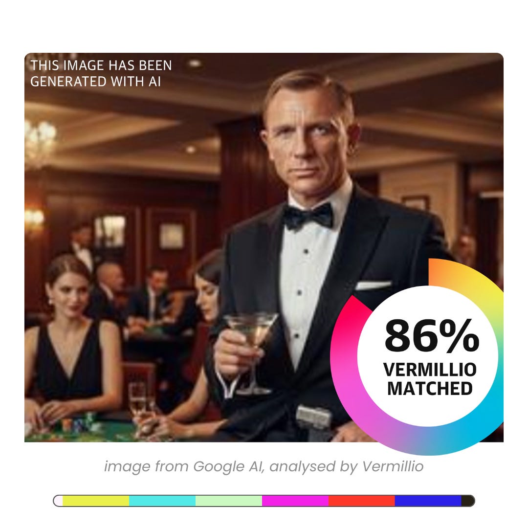
There is a platform that claims it can expose exactly how much copyrighted art is used by AI tools. ‘Vermillio’ tracks use of a client’s IP online, then says its possible to create a “neural fingerprint”, and approximately trace the percentage to which an AI-generated output has ‘taken’ from copyrighted material.

Floyd fan? Some time back I explored ‘50 Wistful Years: Pink Floyd’s commemoration of a burning man’ in my other substack, Coffee & Conversations.

This article comes at the perfect time, I was just looking at some campaign aestetics. I really liked your point about 'Zohran was interested in pushing how expressive it could be', it's so true how much design communicates. But does a brand truly capture someone's entire character?